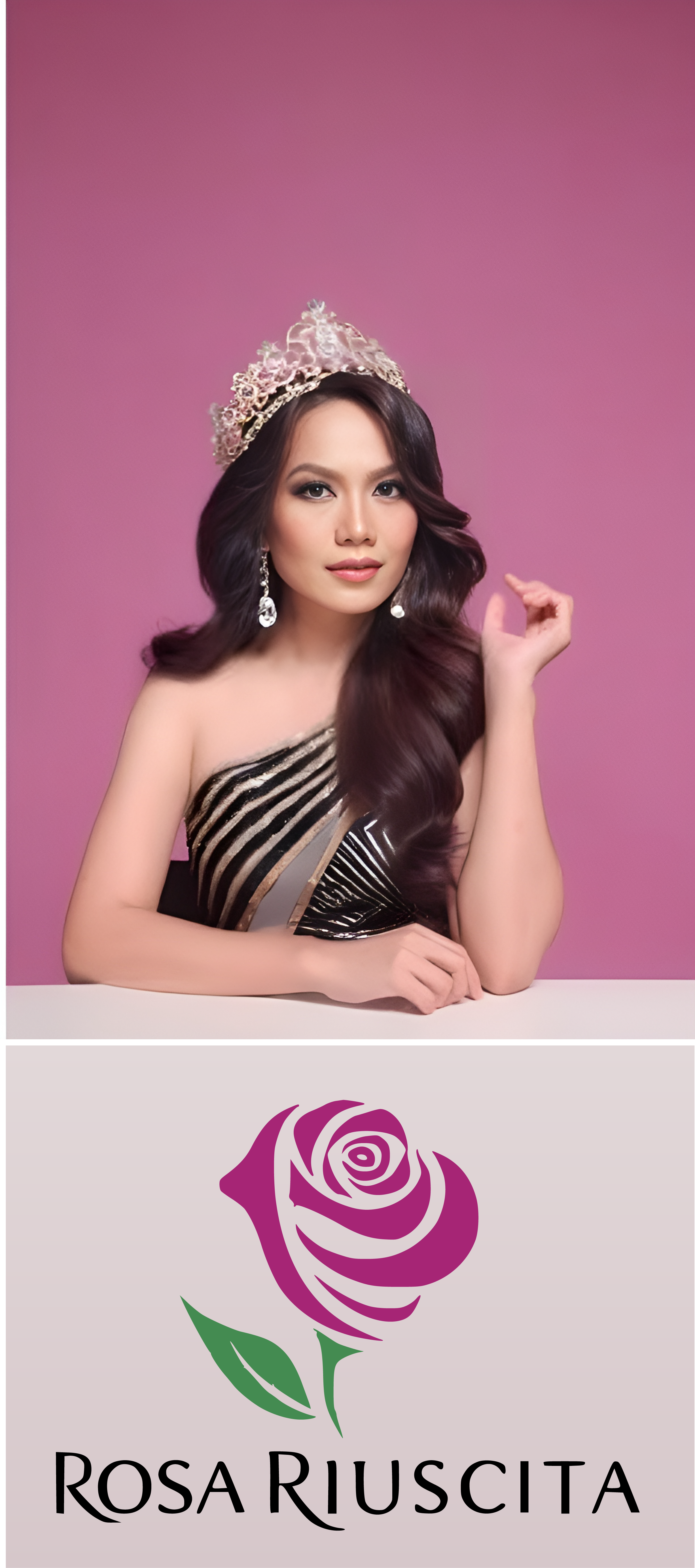
Know more about the Rosa Riuscita
The symbolism and meaning behind the colours and elements of the logo for "Rosa Riuscita" is as follows:
Pink Rose
Pink is often associated with femininity, grace, and charm. The rose itself symbolizes beauty, love, and elegance, aligning perfectly with the essence of a personifying elegance
Green Leaf
Green represents growth, vitality, and renewal. It can symbolize the growth and development of all women associate with Rosa Riuscita, as well as the freshness and natural beauty they embody.
Black Writing
Black signifies sophistication, elegance, and authority. The black text for the "Rosa Riuscita," personifies a touch of class and professionalism to the logo, indicating that any initiative of Rosa Riuscita is well-organised and prestigious.
Combining these elements, the logo is designed to communicate a message of elegance, femininity, growth, and sophistication. It is meant to capture the essence of a beauty pageant business, conveying a sense of beauty, grace, and prestige that participants and audiences alike can aspire to.
Partners & Sponsors
Beauty Pageants, Event Management & Women Empowerment